Outcome & Validation
graph TD
A[Traffic Source] --> B{Split Test}
B --> C[Variant A: Control]
B --> D[Variant B: Clean Design]
C --> E[Conversion Data]
D --> F[Conversion Data]
E --> G[Analysis]
F --> G
style A fill:#1a1a1a,stroke:#F3C518,stroke-width:2px,color:#fff
style B fill:#333,stroke:#F3C518,stroke-width:4px,color:#F3C518
style C fill:#1a1a1a,stroke:#F3C518,stroke-width:2px,color:#fff
style D fill:#1a1a1a,stroke:#F3C518,stroke-width:2px,color:#fff
style G fill:#1a1a1a,stroke:#F3C518,stroke-width:2px,color:#fff
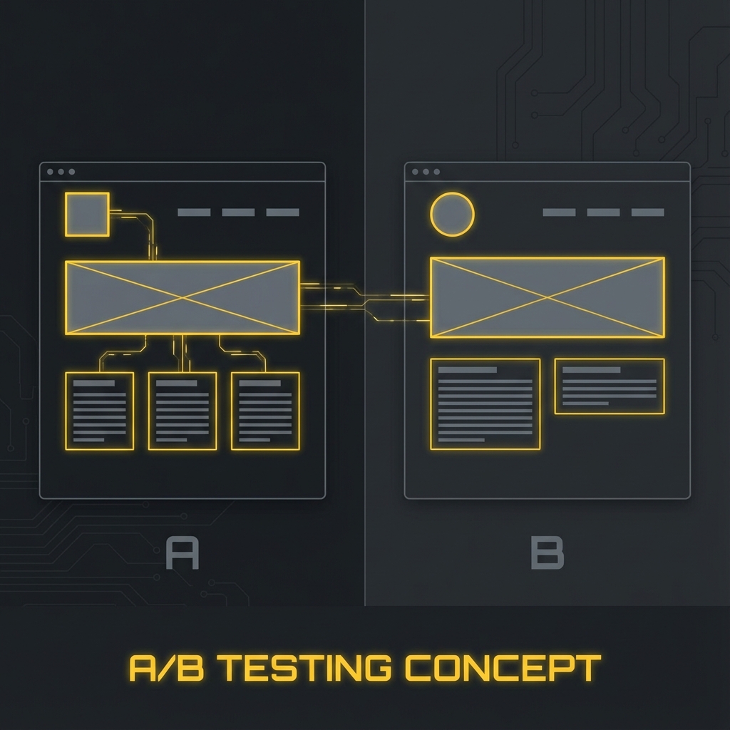
Early-stage startups often struggle to communicate value clearly, leading to high bounce rates and low sign-ups.
The Hypothesis
Clear positioning and focused CTAs will outperform feature-heavy messaging.
What We Built
- A startup landing page
- 2 headline variants
- 2 CTA variants
- Minimal distraction layout
Experiment Setup
- Small traffic test
- Compared engagement between variants
- Tracked behaviour instead of vanity metrics
What We Measured
- Click-through rate
- Time on page
- CTA interactions
- Scroll depth
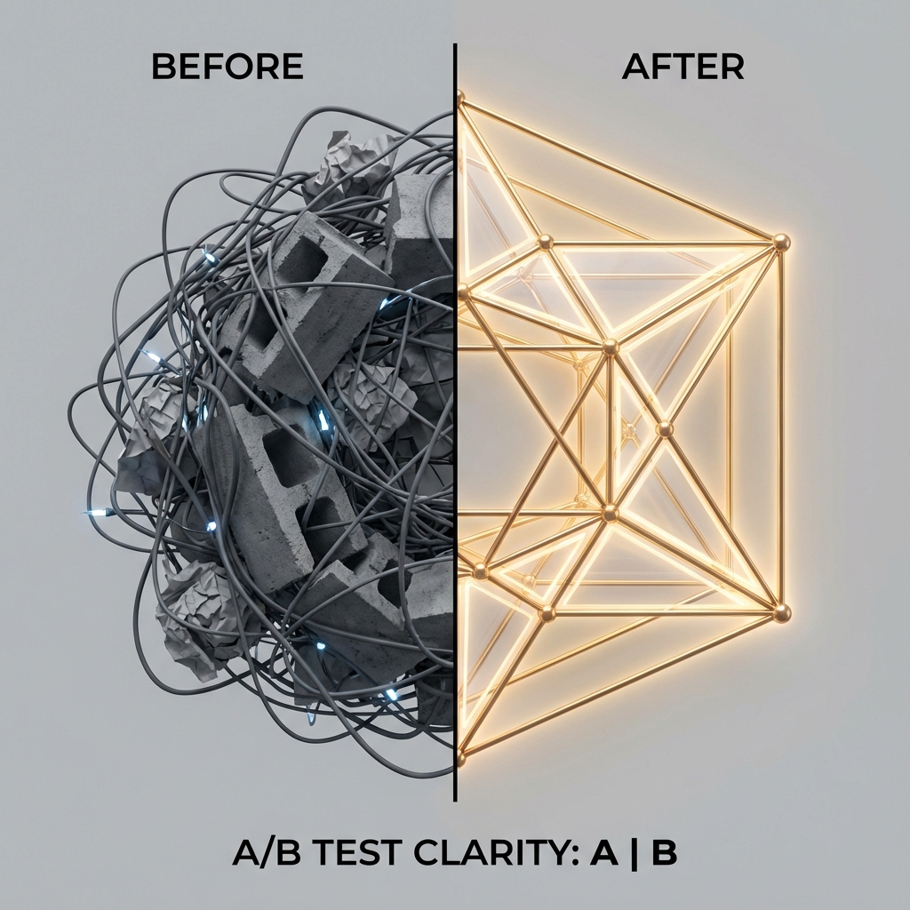
Key Learnings
- Startups must sell clarity before features
- Less copy often increases engagement
- CTA language significantly affects intent