The Problem
Many websites overwhelm users with too much information too early.
The Objective
Improve clarity, reduce friction, and guide users toward one primary action.
What Was Changed
- Hero messaging rewritten
- CTA hierarchy simplified
- Content reordered for decision flow
- Visual noise reduced
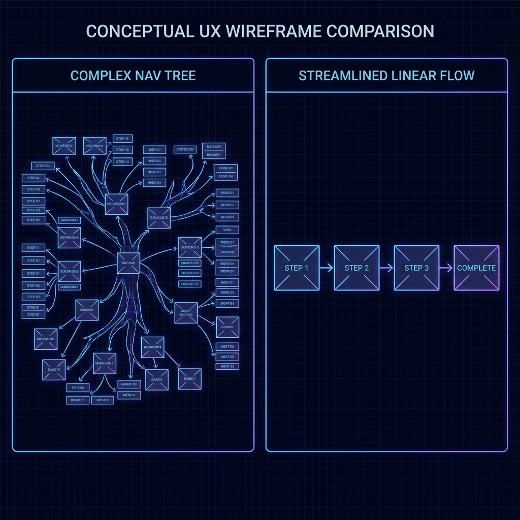
Before vs After Focus

graph LR
A[Old Nav] .-> B[User Confusion]
C[New Nav] --> D[Simplicity]
D --> E[Conversion]
style A fill:#333,stroke:#666,stroke-width:1px,color:#aaa,stroke-dasharray: 5 5
style B fill:#333,stroke:#666,stroke-width:1px,color:#aaa,stroke-dasharray: 5 5
style C fill:#1a1a1a,stroke:#F3C518,stroke-width:2px,color:#fff
style D fill:#1a1a1a,stroke:#F3C518,stroke-width:2px,color:#fff
style E fill:#333,stroke:#F3C518,stroke-width:4px,color:#F3C518
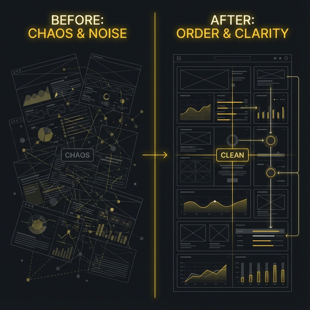
Before
- Feature-heavy
- Multiple CTAs
- Unclear value
After
- Outcome-driven
- One primary action
- Clear narrative
Outcome & Validation
- Improved readability
- Faster comprehension
- Clearer decision path
Key Learnings
- Clarity beats cleverness
- Users scan before they read
- One goal per page performs better
