The Problem
Most cafés lose customers not because of bad coffee, but because of slow ordering, unclear menus, and poor online discovery.
Pain Points:
- Long queues during peak hours
- Customers unsure what to order
- Instagram & Google traffic not converting
- No clear digital flow from discovery to purchase
The Objective
Build a simple, fast, and intuitive system that helps customers decide faster, order ahead, and return more often.
The User Journey
graph LR
A[Discovery] --> B[Menu Browsing]
B --> C[Customisation]
C --> D[Secure Payment]
D --> E[Order Tracking]
style A fill:#1a1a1a,stroke:#F3C518,stroke-width:2px,color:#fff
style B fill:#1a1a1a,stroke:#F3C518,stroke-width:2px,color:#fff
style C fill:#333,stroke:#F3C518,stroke-width:4px,color:#F3C518
style D fill:#1a1a1a,stroke:#F3C518,stroke-width:2px,color:#fff
style E fill:#1a1a1a,stroke:#F3C518,stroke-width:2px,color:#fff
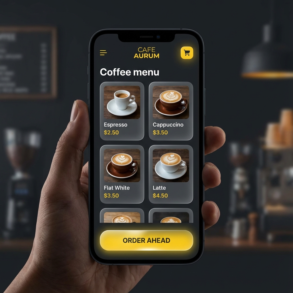
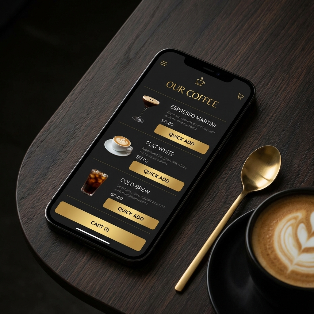
The System We Built
- Conversion-focused website: Streamlined for speed and action.
- Simplified menu structure: Reduced cognitive load for faster decisions.
- Order-ahead checkout flow: Seamless "skip the queue" functionality.
- Trust layer: Integrated reviews & social proof.
- Local discovery optimisation: Strategy to capture nearby foot traffic.
Key Decisions
- Prioritised speed over aesthetics on mobile.
- Reduced menu cognitive load instead of expanding options.
- Designed checkout for "skip the queue" use-case.
- Made Google Maps → website flow frictionless.
Execution Highlights
- Mobile-first UX
- Clear primary CTA: Order Ahead
- Minimal steps from menu to checkout
- Fast-loading layout optimised for local users
Outcome & Validation
The system successfully demonstrated how digital touchpoints can reduce ordering friction and improve the in-store experience.
Measured / Observed:
- Faster completion of order flow
- Clearer decision-making during menu browsing
- Positive qualitative feedback on usability
*(No revenue claims — system validation focus)*
Key Learnings
- Cafés benefit more from clarity than complexity.
- Decision speed matters more than visual novelty.
- Operational thinking beats "marketing-only" approaches.